Regression tables are the evidence. Plots are the quick read. Use
km_plot(), km_risk_table(),
rmst_table(), survival_summary(),
survival_quantiles(), survival_prob(),
logrank_test(), surv_model_compare(),
plot_surv_fit(), surv_predict(),
plot_reg(), plot_reg_combine(),
forest_df(), and forest_reg() to visualise
survival and regression results, inspect reference categories, and
prepare figures for manuscripts or reports.
library(gtregression)
library(dplyr)

data("data_birthwt", package = "gtregression")
data("data_lungcancer", package = "gtregression")

birthwt_data <- data_birthwt |>
  mutate(
    race = factor(race, levels = c(1, 2, 3),
                  labels = c("White", "Black", "Other")),
    smoke = factor(smoke, levels = c(0, 1), labels = c("No", "Yes")),
    ht = factor(ht, levels = c(0, 1), labels = c("No", "Yes")),
    ui = factor(ui, levels = c(0, 1), labels = c("No", "Yes")),
    low = factor(low, levels = c(0, 1), labels = c("Normal BW", "Low BW")),
    ptl_cat = factor(ifelse(ptl > 0, "Yes", "No"), levels = c("No", "Yes")),
    ftv_cat = factor(case_when(
      ftv == 0 ~ "None",
      ftv == 1 ~ "One",
      ftv >= 2 ~ "Two or more"
    ), levels = c("None", "One", "Two or more"))
  )

birthwt_exposures <- c(
  "age", "lwt", "race", "smoke", "ht", "ui", "ptl_cat", "ftv_cat"
)

attr(birthwt_data$age, "label") <- "Maternal age"
attr(birthwt_data$lwt, "label") <- "Maternal weight"
attr(birthwt_data$race, "label") <- "Maternal race"
attr(birthwt_data$smoke, "label") <- "Smoking during pregnancy"
attr(birthwt_data$ht, "label") <- "Hypertension"
attr(birthwt_data$ui, "label") <- "Uterine irritability"
attr(birthwt_data$ptl_cat, "label") <- "Previous preterm labour"
attr(birthwt_data$ftv_cat, "label") <- "First trimester visits"

birthwt_desc <- descriptive_table(
  birthwt_data,
  exposures = birthwt_exposures,
  by = "low",
  show_overall = "last"
)
birthwt_uni <- uni_reg(
  birthwt_data,
  outcome = "low",
  exposures = birthwt_exposures,
  approach = "logit"
)
birthwt_multi <- multi_reg(
  birthwt_data,
  outcome = "low",
  exposures = c("smoke", "ht", "ui", "ptl_cat", "ftv_cat"),
  adjust_for = c("age", "lwt", "race"),
  approach = "logit"
)

lung_data <- data_lungcancer |>
  mutate(
    trt = factor(trt, levels = c(1, 2),
                 labels = c("Standard treatment", "Test treatment")),
    prior = factor(prior, levels = c(0, 10), labels = c("No", "Yes"))
  )

lung_surv <- surv_reg(
  data = lung_data,
  time = time,
  event = status,
  exposures = "trt",
  adjust_for = c("age", "karno"),
  distribution = weibull
)
Kaplan-Meier Curve
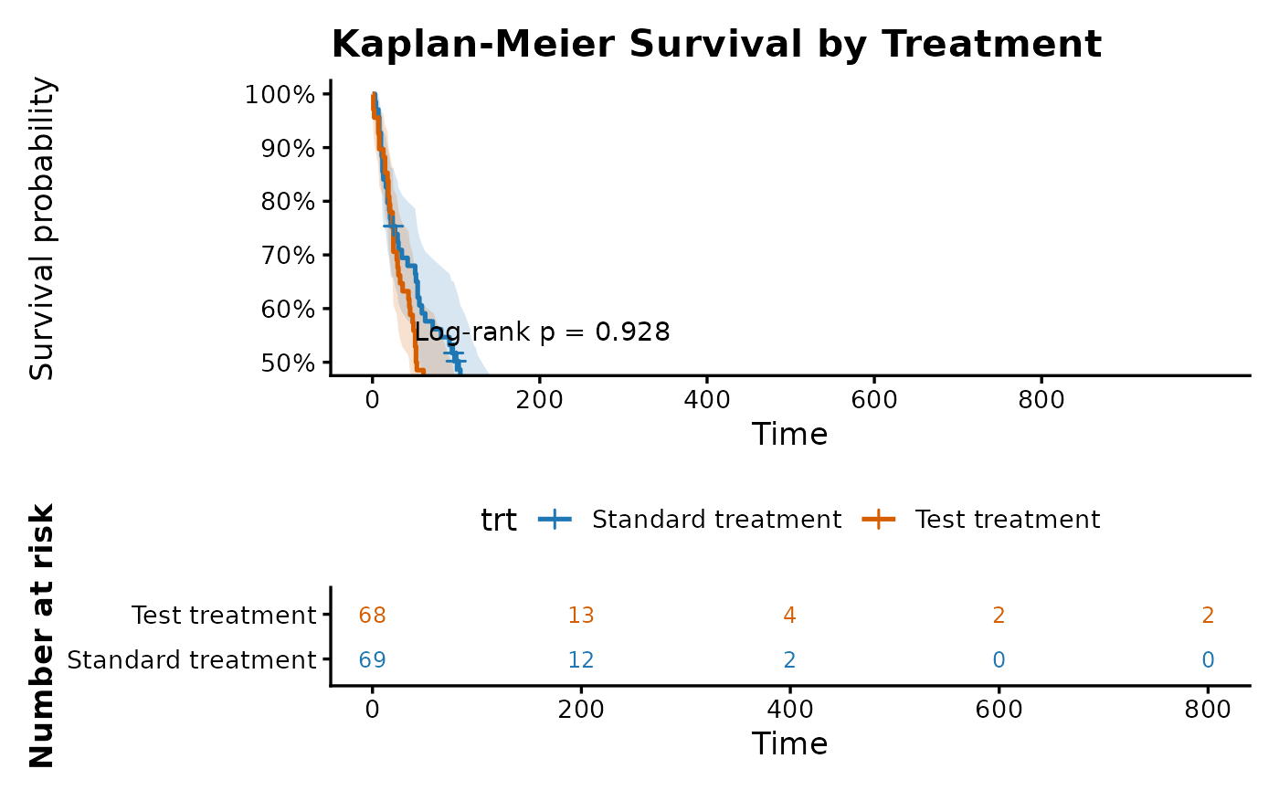
km_plot() gives the survival curve before regression
modelling. Use it to show the observed survival experience by group,
with optional confidence intervals, censoring marks, log-rank p-value,
and number-at-risk table. If the curves sit near the top of the graph,
use ylim = c(50, 100) on the default percentage scale, or
ylim = c(0.5, 1) when y_percent = FALSE.
km_plot(
  data = lung_data,
  time = time,
  event = status,
  by = trt,
  break_time_by = 200,
  ylim = c(50, 100),
  title = "Kaplan-Meier Survival by Treatment"
)
When preparing a multi-panel figure, use compact titles and control
the legend directly. The result remains a normal ggplot object when
risk_table = FALSE, so it can be combined with
patchwork.
km_treatment <- km_plot(
  data = lung_data,
  time = time,
  event = status,
  by = trt,
  risk_table = FALSE,
  title = "A. Treatment",
  title_size = 10,
  title_face = plain,
  legend_position = bottom,
  base_size = 10
)

km_prior <- km_plot(
  data = lung_data,
  time = time,
  event = status,
  by = prior,
  risk_table = FALSE,
  title = "B. Prior therapy",
  title_size = 10,
  title_face = plain,
  legend_position = bottom,
  base_size = 10
)

patchwork::wrap_plots(km_treatment, km_prior, ncol = 2) +
  patchwork::plot_layout(guides = "collect") &
  ggplot2::theme(legend.position = "bottom")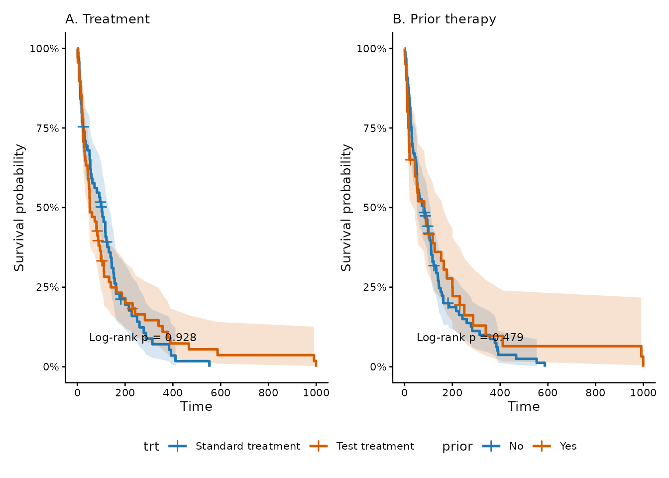
Risk Table
km_risk_table() gives the number at risk at selected
follow-up times as a standalone table. This is useful when the risk
table needs to be reported beside or underneath a Kaplan-Meier
curve.
km_risk_table(
  data = lung_data,
  time = time,
  event = status,
  by = trt,
  times = c(0, 90, 180, 365)
)
Restricted Mean Survival Time
rmst_table() reports the average survival time up to a
fixed follow-up point, called tau. This is useful when
readers want an absolute survival-time summary, or when hazard ratios
are difficult to explain.
rmst_table(
  data = lung_data,
  time = time,
  event = status,
  by = trt,
  tau = 365
)
Kaplan-Meier Summary
survival_summary() is the table companion to the
Kaplan-Meier curve. It reports the number analysed, events, censored
observations, and median survival with a 95% confidence interval. Use it
when readers need the key survival numbers without reading them from the
plot.
survival_summary(
  data = lung_data,
  time = time,
  event = status,
  by = trt
)
Survival Quantiles
survival_quantiles() reports detailed Kaplan-Meier time
points. This is useful when the median alone is not enough, or when you
want to show the 25th, 50th, and 75th percentile event times by
group.
survival_quantiles(
  data = lung_data,
  time = time,
  event = status,
  by = trt
)
Survival Probabilities
survival_prob() reports Kaplan-Meier survival
probability at fixed follow-up times. This is useful for clinically
familiar summaries such as 90-day, 6-month, or 1-year survival.
survival_prob(
  data = lung_data,
  time = time,
  event = status,
  by = trt,
  times = c(90, 180, 365)
)
Log-Rank Test
logrank_test() formally compares Kaplan-Meier curves
between groups. It is useful after the curve and summary table, but it
does not give an effect size; use cox_reg() when a hazard
ratio is needed.
logrank_test(
  data = lung_data,
  time = time,
  event = status,
  by = trt
)
Parametric Survival Model Comparison
surv_model_compare() helps users choose a candidate
distribution before using surv_reg(). It fits the same
model with Weibull, exponential, lognormal, and loglogistic
distributions, then compares AIC and BIC.
surv_model_compare(
  data = lung_data,
  time = time,
  event = status,
  exposures = c("trt", "celltype"),
  adjust_for = c("age", "karno")
)
Parametric Survival Fit Plot
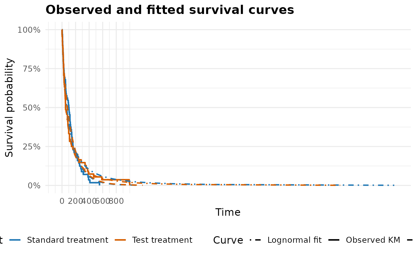
plot_surv_fit() is the visual companion to
surv_model_compare(). It overlays the observed Kaplan-Meier
curve with fitted parametric survival curves, so users can check whether
a distribution that looks good by AIC/BIC also follows the observed
survival pattern.
plot_surv_fit(
  data = lung_data,
  time = time,
  event = status,
  by = trt,
  distributions = c(weibull, lognormal),
  break_time_by = 200
)
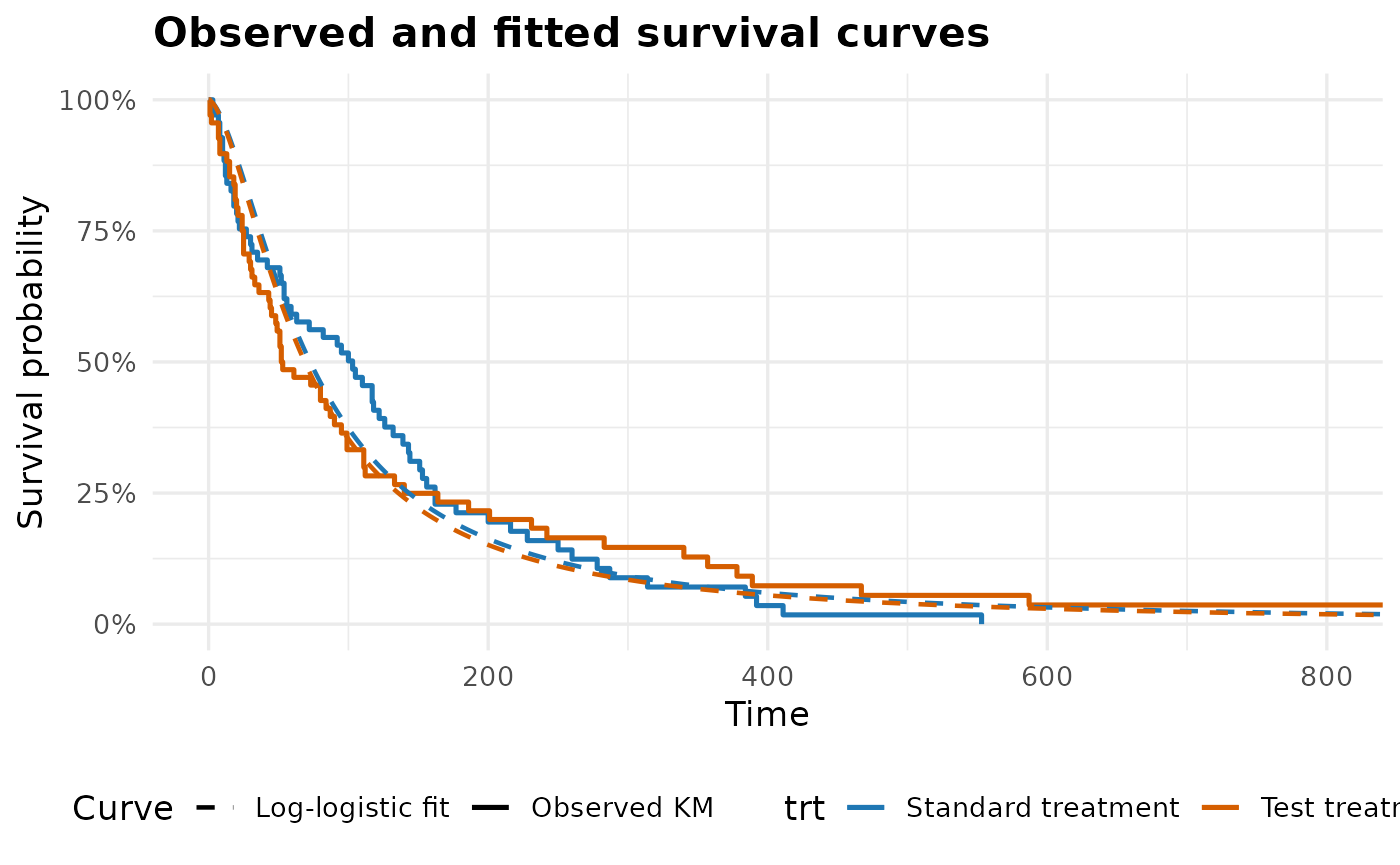
Adjusted fitted curves can also be drawn. In that case, the curves are predicted at typical adjustment values, such as medians for numeric variables and the most common level for categorical variables.
plot_surv_fit(
  data = lung_data,
  time = time,
  event = status,
  by = trt,
  adjust_for = c(age, karno),
  distributions = loglogistic,
  xlim = c(0, 800)
)
Parametric Survival Prediction
surv_predict() turns a fitted parametric survival model
into predicted survival probabilities at clinically useful follow-up
times. This helps users move from a time-ratio table to a more direct
statement such as predicted 90-day, 180-day, or 1-year survival for a
profile.
surv_predict(
  model = lung_surv$models$trt,
  newdata = data.frame(
    trt = factor("Test treatment", levels = levels(lung_data$trt)),
    age = 60,
    karno = 70
  ),
  times = c(90, 180, 365)
)
If newdata is omitted, surv_predict() uses
a typical profile from the model data, using medians for numeric
variables and the most common level for categorical variables.
One Regression Plot
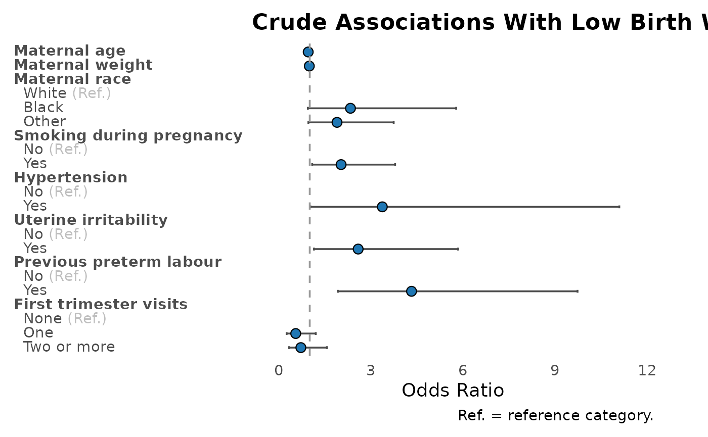
plot_reg() turns a uni_reg() or
multi_reg() result into a forest-style plot. By default,
categorical reference levels are shown and labelled as
(Ref.); the caption explains the abbreviation. Variable
labels set on the data are used automatically in the plot.
The default style uses colour-blind-safe blue estimates and
vermillion for estimates whose confidence interval excludes the null.
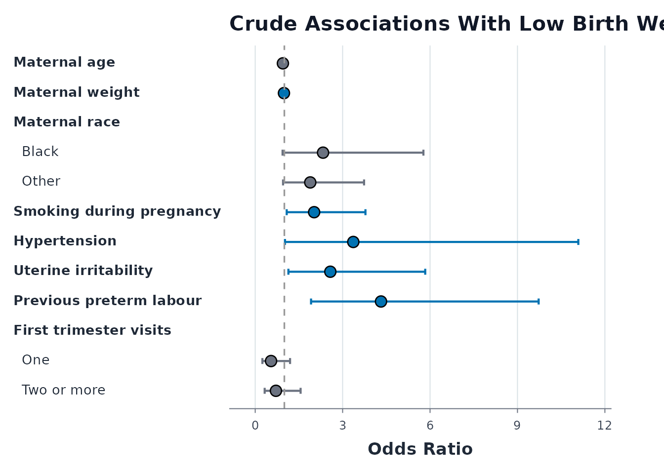
Use point_size, point_stroke,
ci_linewidth, and base_size when preparing a
slide or a larger single-panel figure.
plot_reg(
  birthwt_uni,
  title = "Crude Associations With Low Birth Weight"
)
plot_reg(
  birthwt_uni,
  show_ref = FALSE,
  point_size = 3.5,
  point_stroke = 0.7,
  ci_linewidth = 0.75,
  base_size = 13,
  title = "Crude Associations With Low Birth Weight"
)
Adjusted Regression Plot
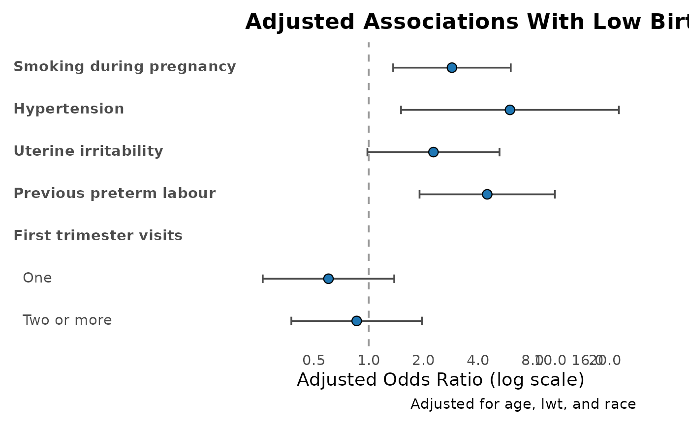
When the input comes from multi_reg(adjust_for = ...),
the adjustment set is shown in the plot caption by default. This keeps
the figure interpretable when it is copied into slides or a manuscript
draft.
plot_reg(
  birthwt_multi,
  show_ref = FALSE,
  log_x = TRUE,
  title = "Adjusted Associations With Low Birth Weight"
)
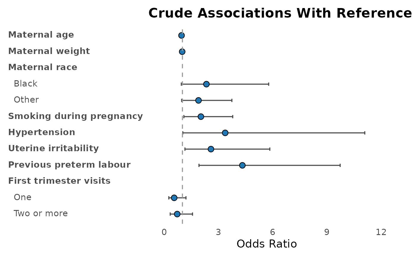
Compact Binary Predictors
For Yes/No, 1/0, true/false, or similar binary predictors, set
show_ref = FALSE to hide reference rows. Affirmative binary
levels such as Yes are displayed as the exposure name
itself, so the plot remains compact: smoke,
ht, ui, and ptl_cat are easier to
read than repeated variable: Yes labels.
plot_reg(
  birthwt_uni,
  show_ref = FALSE,
  title = "Crude Associations With Reference Rows Hidden"
)
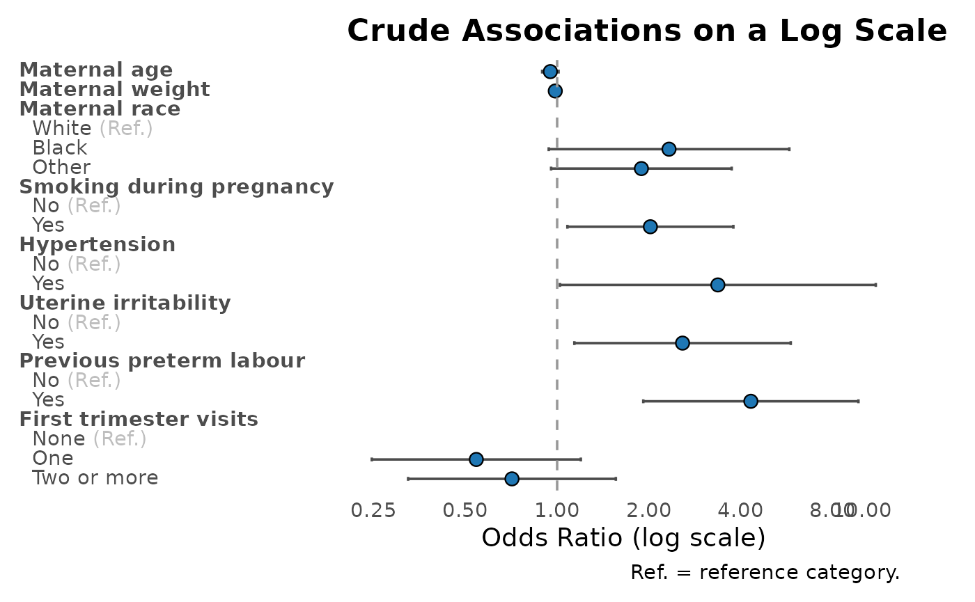
Log Axis and Tick Marks
For ratio measures such as odds ratios, risk ratios, and incidence
rate ratios, log_x = TRUE uses a log-scaled x-axis. If you
do not provide tick marks, gtregression chooses sensible
defaults around the null value of 1.
plot_reg(
  birthwt_uni,
  log_x = TRUE,
  title = "Crude Associations on a Log Scale"
)
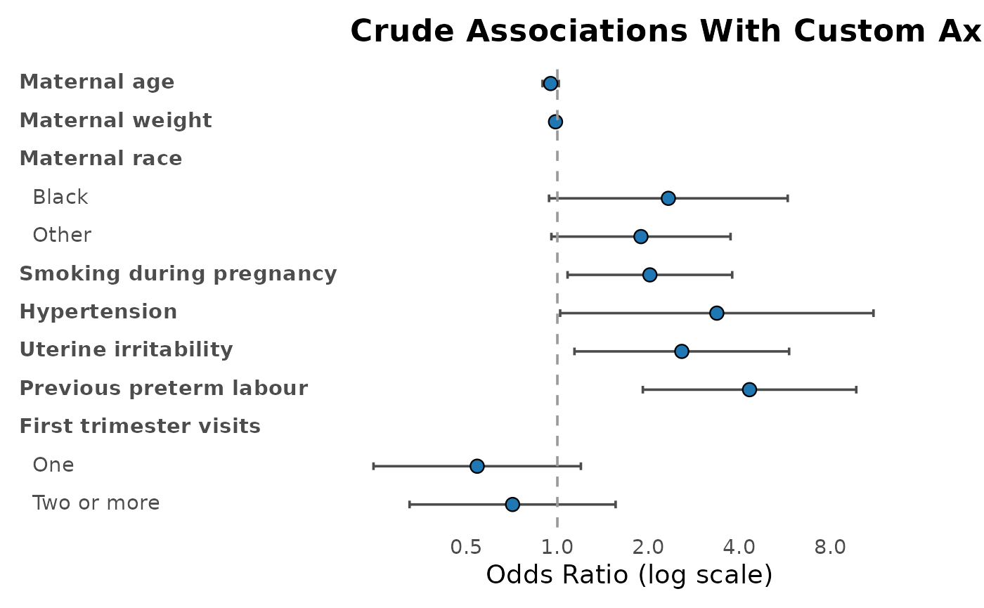
You can still take full control of the visible axis range and tick marks.
plot_reg(
  birthwt_uni,
  show_ref = FALSE,
  log_x = TRUE,
  xlim = c(0.25, 12),
  breaks = c(0.5, 1, 2, 4, 8),
  title = "Crude Associations With Custom Axis"
)
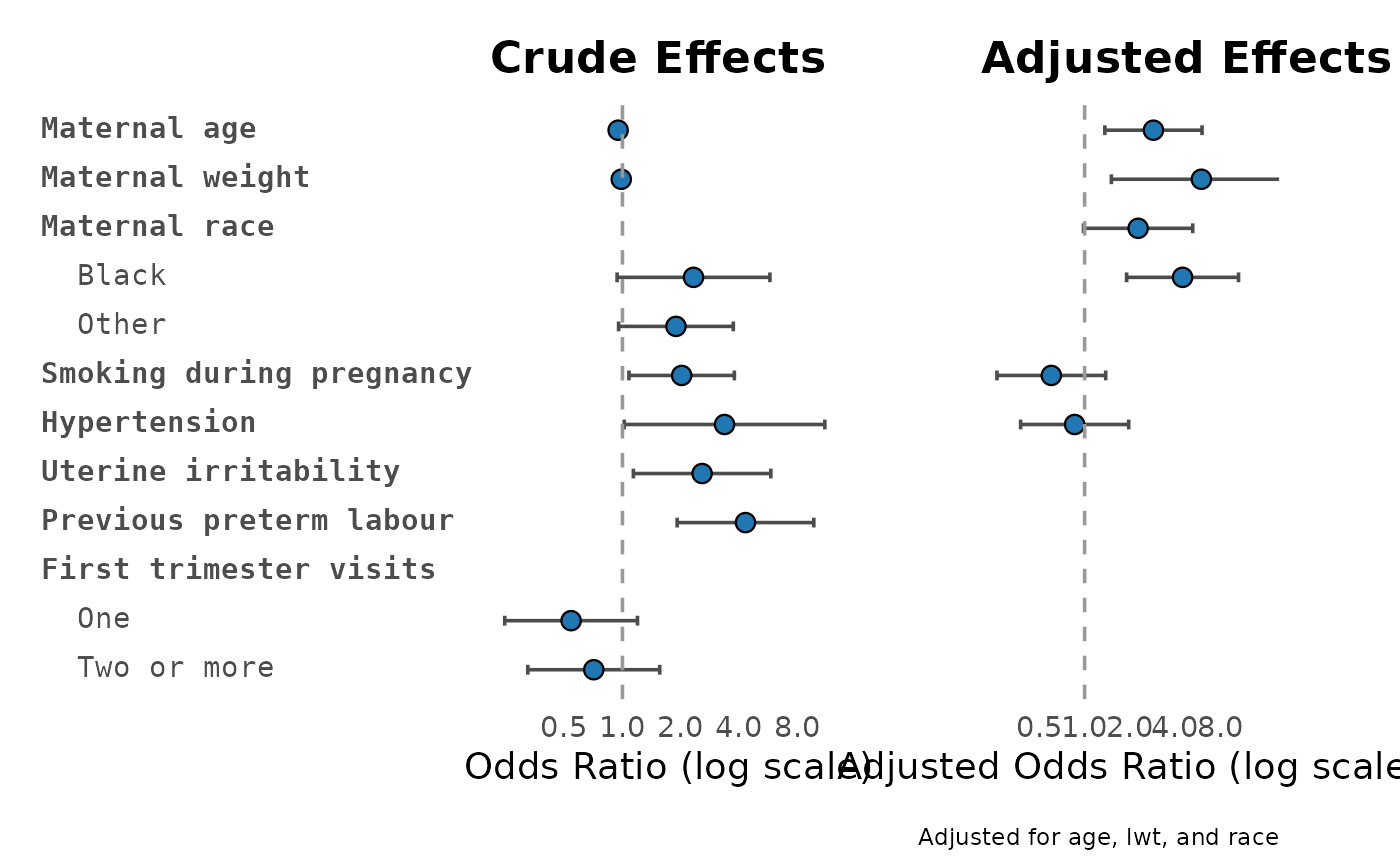
Compare Crude and Adjusted Effects
plot_reg_combine() places crude and adjusted model
results side by side. This is useful when a manuscript needs to show how
adjustment changes the estimate. Axis limits and tick marks can be
controlled separately for each side.
plot_reg_combine(
  tbl_uni = birthwt_uni,
  tbl_multi = birthwt_multi,
  show_ref = FALSE,
  log_x = TRUE,
  xlim_uni = c(0.25, 12),
  breaks_uni = c(0.5, 1, 2, 4, 8),
  xlim_multi = c(0.25, 16),
  breaks_multi = c(0.5, 1, 2, 4, 8),
  title_uni = "Crude Effects",
  title_multi = "Adjusted Effects"
)
Publication-Style Forest Table
forest_df() prepares the data. forest_reg()
draws the forest table. This is the most manuscript-oriented plot when
you want descriptive summaries and crude or adjusted estimates in the
same figure.
forest_data <- forest_df(
  uni = birthwt_uni,
  multi = birthwt_multi,
  desc = birthwt_desc
)
forest_reg(forest_data)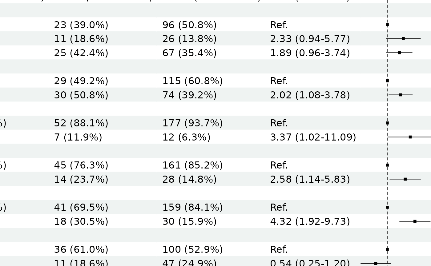
Fine-Tune Forest Tables
Wide forest tables combine descriptive summaries, crude estimates,
adjusted estimates, and one or two forest plot panels. If the x-axis
labels are crowded, control the axis range and tick marks with
xlim and ticks_at.
Use a list when the table has crude and adjusted forest plot columns.
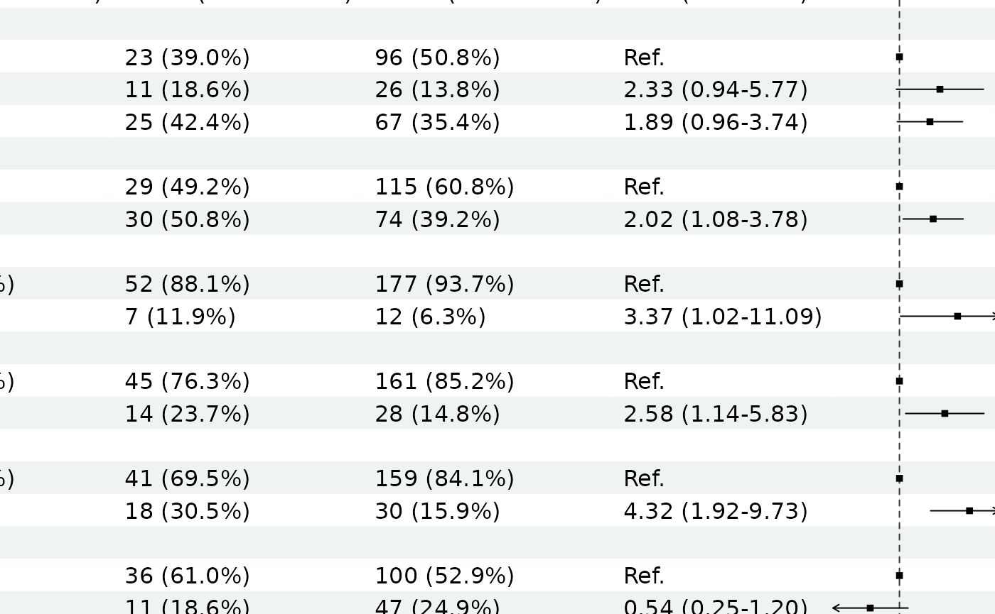
forest_reg(
  forest_data,
  xlim = list(c(0.25, 8), c(0.8, 25)),
  ticks_at = list(
    c(0.5, 1, 2, 4, 8),
    c(1, 2, 4, 8, 16)
  ),
  quiet = TRUE
)
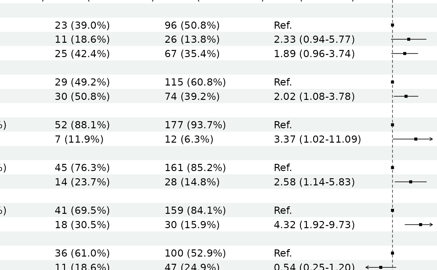
If the plot panel itself looks too narrow or too wide, tune
ci_col_width. This changes the blank spacer column that
forestploter uses for drawing the confidence intervals.
Larger values give the CI panel more room; smaller values make the
overall table more compact.
forest_reg(
  forest_data,
  ci_col_width = c(18, 22),
  xlim = list(c(0.25, 8), c(0.8, 25)),
  ticks_at = list(
    c(0.5, 1, 2, 4, 8),
    c(1, 2, 4, 8, 16)
  )
)
For publication export, use a wider graphics device or document canvas when the table includes several descriptive columns and two model columns.
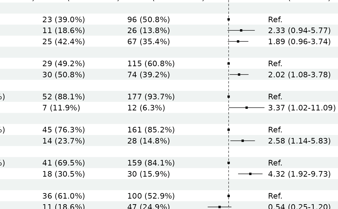
You can also build and draw in one call.
forest_reg(
  uni = birthwt_uni,
  multi = birthwt_multi,
  desc = birthwt_desc,
  side = "left"
)
What To Inspect
-
plot_reg()returns aggplot. -
plot_reg_combine()returns a combinedggplot. -
km_risk_table()reports at-risk, event, and censored counts at requested follow-up times. -
rmst_table()reports restricted mean survival time up to a chosen time point. -
show_ref = TRUEdisplays reference levels as(Ref.). -
show_ref = FALSEhides reference levels; affirmative binary predictors are shown as compact bold exposure rows. - Adjustment variables from
multi_reg(adjust_for = ...)are carried into plot captions. -
log_x = TRUEuses log scaling for non-linear model effect measures. -
forest_df()returns the plotting data frame. -
survival_prob()reports survival probability at requested follow-up times. -
surv_model_compare()compares parametric survival distributions before fitting finalsurv_reg()tables. -
plot_surv_fit()overlays fitted parametric survival curves on the observed Kaplan-Meier curve. -
surv_predict()reports model-based survival probabilities at user-specified follow-up times. - In
forest_reg(), usexlimandticks_atwhen x-axis labels overlap. - In
forest_reg(), useci_col_widthwhen the CI plot panel is too narrow or too wide. -
forest_reg()returnsplot,data,input_data, andmeta.